Dans Ametys, la configuration du ruban (partie du haute de l'interface graphique) est propre à chaque typologie de site.
Elle est définie dans le fichier WEB-INF/param/cms-ribbon-[siteType].xml (ex: cms-ribbon-default.xml).
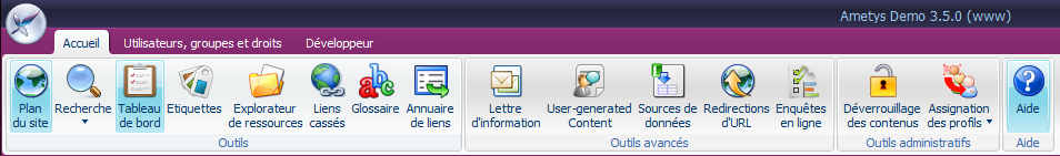
| Exemple de ruban pour un site de type "site institutionnel" |
|
|---|---|
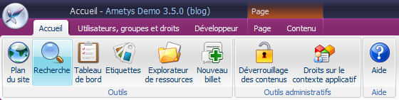
| Exemple de ruban pour un site de type "blog" |
|
Ce fichier définit la liste des boutons/menus accessibles mais également l'organisation de ces derniers. C'est donc ce fichier qu'il faut modifier pour ajouter, supprimer ou déplacer un bouton ou menu.
Remarque
Selon ses droits, un contributeur aura accès à tout ou une partie des éléments du ruban. Voici par exemple, l'accès à l'application de démonstration avec 3 profils de droits différents :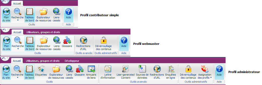
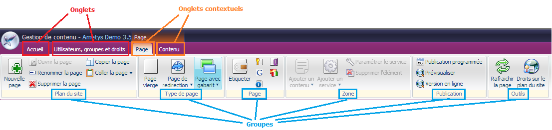
Organisation du ruban
Le fichier WEB-INF/param/cms-ribbon-[siteType].xml définit les outils et actions accessibles depuis le ruban.
Les éléments du ruban sont organisés en onglets (tab) et en groupes (group).
Certains onglets sont des onglets contextuels. Ils apparaissent ou disparaissent en fonction du contexte courant : ouverture d'un outil, sélection d'un contenu, ...
Extrait de fichier cms-ribbon-*.xml
<ribbon  xmlns:xsi="http://www.w3.org/2001/XMLSchema-instance" xsi:noNamespaceSchemaLocation="http://ametys.org/cms/3.0/ribbon.xsd">
    <tabs>
        <tab label="RIBBON_TABS_TAB_HOME_LABEL">
            <groups>
                <group label="RIBBON_TABS_TAB_HOME_GROUPS_GROUP_TOOL_LABEL" icon="">
                    ...
                </group>
                <group label="RIBBON_TABS_TAB_HOME_GROUPS_GROUP_ADVANCED_TOOL_LABEL" icon="">
					...
                </group>
				...
            </groups>
        </tab>
		<tab label="RIBBON_TABS_TAB_RIGHTS_HANDLE_LABEL">
			 ...
		</tab>
		...
		<import>plugin:cms://ribbon/cms-ribbon-content.xml</import>
	</tabs>
</ribbon>
Les onglets
Chaque balise <tab> définit un nouvel onglet dans le ruban.
Il existe deux types d'onglets : les onglets permanents et les onglets contextuels.
Onglet permanent
Un onglet permanent est un onglet qui est visible quelque soit le contexte courant. Il est simplement définit par un libellé (label).
Déclaration de l'onglet "Accueil"
<tab label="RIBBON_TABS_TAB_HOME_LABEL">
	...
</tab>
Le libellé (label) est une clef i18n. Le catalogue utilisé par défaut est celui de l'application (WEB-INF/i18n/application_*.xml). Pour plus d'informations sur l'internationalisation, veuillez consulter la page Internationalisation.
Onglet contextuel
Un onglet contextuel est un onglet qui apparaît et disparaît en fonction du contexte courant. Par exemples, l'onglet "Page" est visible lors de la sélection d'une page, l'onglet "Glossaire" est visible lorsque l'outil "Glossaire" est ouvert.
Visuellement, un tel onglet est coloré et appartient à un groupement d'onglets contextuels.
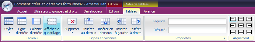
Par exemple, lors d'une édition d'un tableau, deux onglets contextuels "Tableau" et "Avancé" apparaissent et ils sont groupés ensemble sous le libellé "Outils de tableau".
Techniquement, un tel onglet est associé à une logique (principalement pour répondre à la question : "dans quel cas est il visible ?"). Chaque "logique" d'onglet contextuel est défini par un point d'extension org.ametys.cms.workspace.ribbon.RibbonTabsManager.
La déclaration est donc la suivante :
<tab label="plugin.web:RIBBON_TABS_TAB_PAGE_LABEL" id="org.ametys.cms.page.Tab" contextualColor="2" contextualGroup="A" contextualLabel="plugin.web:RIBBON_TABS_TAB_PAGE_LABEL">
	...
</tab>
Le libellé (label) est une clef i18n comme dans l'onglet permanent.
L'identifiant (id) est l'identifiant de l'extension utilisée pour gérer la logique d'affichage de l'onglet. Il est donc possible d'utiliser plusieurs fois le même identifiant dans un fichier.
La couleur "contextualColor" est la couleur a utiliser pour l'onglet contextuel. Il s'agit d'un code numérique mais la couleur réelle dépend du thème utilisé.
Dans le thème Ametys par défaut, les couleurs possibles sont les suivantes :
- Rouge
- Orange
- Jaune
- Vert
- Bleu
- Violet
L'identifiant du groupe contextuel "contextualGroup" est une chaîne de caractère qui sert d'identifiant unique.
Tous les onglets d'un même groupe doivent partager le même "contextualGroup" et être placé côte à côte dans ce fichier.
La couleur du groupe est déterminé par la couleur du premier onglet défini dans ce groupe : un groupe peut donc contenir des onglets de couleurs différentes.
Le libellé du groupe contextuel "contextualLabel" est une clef i18n comme le libellé. Comme pour la couleur, seul le libellé du 1er onglet du group est pris en compte pour le groupe.
Les groupes
Un groupe permet de regrouper un ensemble de bouton au sein d'un même onglet.
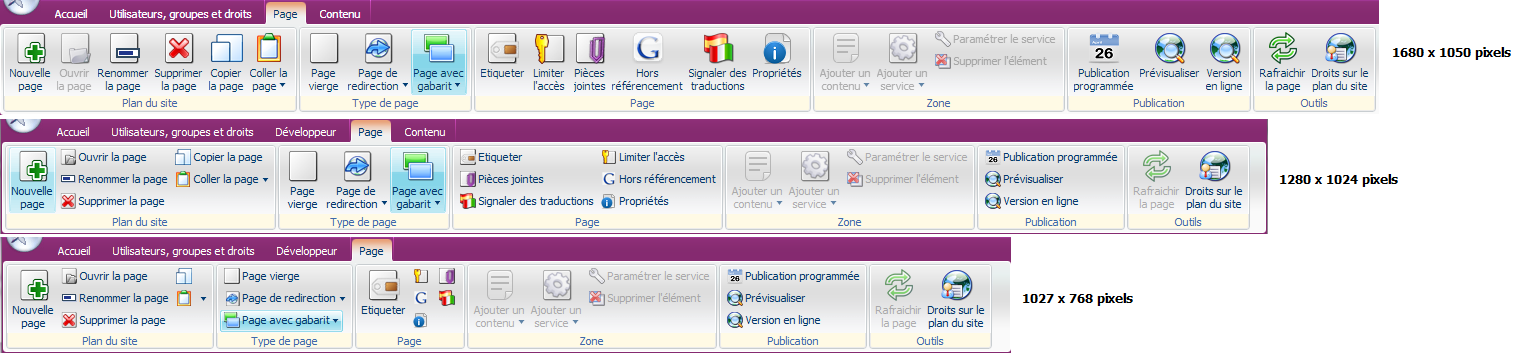
La taille du groupe et ses éléments est capable de s'adapter en fonction de la largeur de l'écran du contributeur.
C'est pourquoi 3 configuration (large, medium, small) sont définies pour chaque groupe. En fonction de la largeur de l'écran, une ou l'autre des configurations sera utilisée de manière à optimiser la place disponible.
Voici pour exemple l'affichage de l'onglet "Page" en fonction de 3 résolutions d'écran :
<group label="plugin.cms:RIBBON_TABS_TAB_CONTENT_EDIT_GROUPS_GROUP_GENERAL_LABEL" icon="" priority="-10">
    <large>
        <control id="org.ametys.web.edition.Save"/>
        <control id="org.ametys.web.edition.UnSave"/>
        <layout size="small">
            <control id="org.ametys.cms.edition.Undo"/>
            <control id="org.ametys.cms.edition.Redo"/>
        </layout>
    </large>
    <medium>
        <control id="org.ametys.web.edition.Save"/>
        <layout size="small">
            <control id="org.ametys.web.edition.UnSave"/>
            <control id="org.ametys.cms.edition.Undo"/>
            <control id="org.ametys.cms.edition.Redo"/>
        </layout>
    </medium>
    <small>
        <control id="org.ametys.web.edition.Save"/>
        <layout size="very-small">
            <control id="org.ametys.web.edition.UnSave"/>
            <control id="org.ametys.cms.edition.Undo"/>
            <control id="org.ametys.cms.edition.Redo"/>
        </layout>
    </small>
</group>
Le libellé (label) est une clef i18n comme pour les onglets.
L’icône (icon) est une icone représentant le groupe en cas de taille extrêmement réduite. Cette fonctionnalité n'est actuellement pas utilisée.
La priorité (priority) du groupe permet de donner plus de poids à certains groupes. La valeur par défaut est "0" et en cas d'égalité, les groupes de gauches sont prioritaires.
Par défaut, en cas de résolution basse, les groupes de droites seront réduits en premiers, cette valeur permet de changer ce comportement.
Seule la taille <medium> est obligatoire. En l'absence de configuration <large> ou <small>, c'est <medium> qui est utilisé tel quel.
Si vous spécifiez plusieurs tailles, la liste des boutons doit être identique dans les 3 configurations. Un bouton ne peut pas par exemple être disponible qu'en vue "large".
Pour ne pas perturber les contributeurs, il est fortement recommandé que les boutons gardent visuellement le même ordre quelle que soit la taille.
Chaque configuration (large, medium, small) définit l'organisation et la place prise par les boutons ou menus
| Bouton large | <control id="org.ametys.web.blankpage"/> <control id="org.ametys.web.linkpage"/> <control id="org.ametys.web.templatesmenu"/> |  |
|---|---|---|
| Bouton petit (icône + texte) | Utilisation de la balise <layout> avec size="small". <layout size="small" align="top"> <control id="org.ametys.web.blankpage"/> <control id="org.ametys.web.linkpage"/> <control id="org.ametys.web.templatesmenu"/> </large> |  |
| Bouton très petit (icône seule) | Utilisation de la balise <layout> avec size="very-small". <layout size="very-small" align="top"> <control id="org.ametys.web.blankpage"/> <control id="org.ametys.web.linkpage"/> <control id="org.ametys.web.templatesmenu"/> </large> |  |
Les boutons sont affichés dans l'ordre dans lequel ils sont décrits dans le fichier mais il faut tenir compte du fait qu'en fonction de leurs droits, certains contributeurs ne verront pas tous les boutons.
Dispositions plus complexes
A la façon des tables HTML, il est possible d'avoir des agencements de boutons un peu plus complexes.
L'attribut "cols" sur la balise <layout> permet de spécifier que l'on souhaite travailler sur plusieurs colonnes et dans ce cas, il est possible de spécifier sur un contrôle l'attribut "colspan" pour indiquer qu'il prend plusieurs emplacements.
L'ordre des boutons est de gauche à droite puis de haut en bas.
Si vous faites simplement plusieurs colonnes de boutons, mettez plusieurs fois <layout> sans préciser de colonne. Le <layout> a plusieurs colonnes ne doit être utilisé que pour jouer sur les "colspan".
Voici un exemple de ce qu'il ne faut pas faire:
<layout align="top" size="very-small" cols="2">
	<control id="org.ametys.web.pageaccess.SetAccess"/>
	<control id="org.ametys.web.userinterface.Attachments"/>
	<control id="org.ametys.web.userinterface.Robots"/>
	<control id="org.ametys.translationflagging.SetTranslation"/>
	<control id="org.ametys.web.page.Properties"/>
</layout>
Il vaut mieux faire ceci, pour obtenir visuellement le même résultat (notez bien le changement de l'odre dans les boutons entre les deux exemples):
<layout align="top" size="very-small">
	<control id="org.ametys.web.pageaccess.SetAccess"/>
	<control id="org.ametys.web.userinterface.Robots"/>
	<control id="org.ametys.web.page.Properties"/>
</layout>
<layout align="top" size="very-small">
	<control id="org.ametys.web.userinterface.Attachments"/>
	<control id="org.ametys.translationflagging.SetTranslation"/>
</layout>
Vous trouverez un exemple de colonage utile avec des "colspan" dans la section suivante consacrée aux barres d'outils.
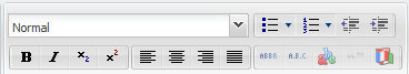
Les barres d'outils
Dans un <layout> il est possible de regrouper les boutons sous forme de barre d'outils au travers de la balise <toolbar>
Dans une barre d'outil, c'est toujours la taille très petite ("very-small") qui est utilisée.
<layout cols="2" align="middle" size="small"> <control id="org.ametys.cms.edition.character.Style" colspan="2"/> <toolbar> <control id="org.ametys.cms.edition.character.Bold"/> <control id="org.ametys.cms.edition.character.Italic"/> <control id="org.ametys.cms.edition.character.Sub"/> <control id="org.ametys.cms.edition.character.Sup"/> </toolbar> <toolbar> <control id="org.ametys.cms.edition.character.AlignLeft"/> <control id="org.ametys.cms.edition.character.AlignCenter"/> <control id="org.ametys.cms.edition.character.AlignRight"/> <control id="org.ametys.cms.edition.character.AlignJustify"/> </toolbar> </layout> <layout align="middle" size="small"> <toolbar> <control id="org.ametys.cms.edition.character.UnorderedList"/> <control id="org.ametys.cms.edition.character.OrderedList"/> <control id="org.ametys.cms.edition.character.Outdent"/> <control id="org.ametys.cms.edition.character.Indent"/> </toolbar> <toolbar> <control id="org.ametys.cms.edition.Abbreviation"/> <control id="org.ametys.cms.edition.Acronym"/> <control id="org.ametys.glossary.editor.AddDefinition"/> <control id="org.ametys.cms.edition.Quote"/> <control id="org.ametys.cms.edition.Language"/> </toolbar> </layout> |
|
Les imports
La balise <import> permet d'importer des fichiers XML de description d'une partie du ribbon.
Cela permet ainsi d'importer des onglets qui seraient définis dans d'autres fichiers xml, sans alourdir le fichier cms-ribbon-*.xml et de mutualiser certaines configuration (entre 2 typologies de site par exemple).
L'url d'import est de la forme plugin:[nom_plugin]://[chemin_du_fichier_relatif_au_plugin].xml
<!-- Cms -->
<import>plugin:cms://ribbon/cms-ribbon-content.xml</import>

<!-- Web -->
<import>plugin:web://ribbon/cms-ribbon.xml</import>

<!-- Inline Media -->
<import>plugin:inlinemedia://cms-ribbon.xml</import>
Exemples de modifications du ruban
Si vous souhaitez modifier l'affichage des icônes du ribbon, il vous faut donc modifier ce fichier cms-ribbon-default.xml :
- vous pouvez supprimer un bouton pour qu'il n'apparaisse plus du tout : par exemple le bouton "Fermer sans enregistrer" ; pensez à le supprimer de toutes les tailles (<large>, <medium> et <small>)
<group label="plugin.cms:RIBBON_TABS_TAB_CONTENT_EDIT_GROUPS_GROUP_GENERAL_LABEL" icon="" priority="-10">
	<large>
    	<control id="org.ametys.web.edition.Save"/>
        <layout size="small">
        	<control id="org.ametys.cms.edition.Undo"/>
            <control id="org.ametys.cms.edition.Redo"/>
        </layout>
    </large>
    <medium>
    	<control id="org.ametys.web.edition.Save"/>
        <layout size="small">
            <control id="org.ametys.cms.edition.Undo"/>
            <control id="org.ametys.cms.edition.Redo"/>
        </layout>
    </medium>
    <small>
    	<control id="org.ametys.web.edition.Save"/>
        <layout size="very-small">
       	 	<control id="org.ametys.cms.edition.Undo"/>
        	<control id="org.ametys.cms.edition.Redo"/>
     	</layout>
    </small>
</group>
- vous pouvez changer le format d'un bouton, en fonction de la taille de la fenêtre : par exemple le bouton "Rétablir" doit être toujours en très petit :
<group label="plugin.cms:RIBBON_TABS_TAB_CONTENT_EDIT_GROUPS_GROUP_GENERAL_LABEL" icon="" priority="-10">
	<medium>
    	<control id="org.ametys.web.edition.Save"/>
       	<control id="org.ametys.cms.edition.Undo"/>
        <layout size="very-small">
            <control id="org.ametys.cms.edition.Redo"/>
        </layout>
    </medium>
    <small>
    	<control id="org.ametys.web.edition.Save"/>
        <layout size="very-small">
       	 	<control id="org.ametys.cms.edition.Undo"/>
        	<control id="org.ametys.cms.edition.Redo"/>
     	</layout>
    </small>
</group>
 Retour en haut