Cette page documente le processus de création d'un formulaire (CMS, ou externe) à l'aide de l'éditeur en ligne. Tous les autres renseignements quant aux fonctionnalités liées aux formulaires dans Ametys sont disponibles à la page suivante : Formulaires.
L'éditeur en ligne des champs riches offre la possibilité de créer et gérer des formulaires dans vos contenus.
Créer un formulaire
En édition, la création d'un formulaire est réalisée par le bouton suivant:
|
|

Formulaire CMS
Un formulaire CMS :
- Stocke les données saisies par les utilisateurs en base de donnée.
- Ces données sont par la suite exploitables grâce à la fonction d'export des données au format Excel (fichier CSV).
- De plus il est possible de définir des destinataires du formulaire qui recevront les données saisies par les internautes.
- Enfin vous pouvez mettre en place un système d'accusé de réception permettant à l'utilisateur de recevoir un email confirmant la bonne réception des données dans l'application.
Dans l'onglet Edition, un formulaire est représenté par:

Dans l'onglet contextuel Formulaire CMS, vous pouvez ajouter des champs et formater votre formulaire
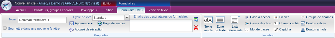
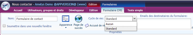
Gérer le Formulaire CMS:
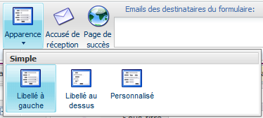
Choisir l'apparence :
Pour que votre site reste accessible, les libellés doivent être à côté des champs. |
|
Ouvrir dans une nouvelle fenêtre : cocher cette case si vous souhaitez que la validation du formulaire s'ouvre dans une nouvelle fenêtre |
|
Cycle de vie : Permet de choisir le cycle de vie à utiliser pour les entrées de formulaire. (voir page Formulaires) | |
Accusé de réception : Permet de choisir le champ contenant une adresse email vers laquelle l'internaute recevra un accusé de réception | |
| Page de succès permet de choisir une page dans le plan du site vers laquelle le visiteur est redirigé après la soumission du formulaire. Par défaut une page hors navigation est automatiquement générée. | |
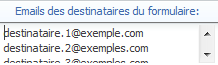
Emails des destinataires du formulaire : entrer les emails des personnes qui vont recevoir les données envoyées par les internautes |
|
Convertir en formulaire externe : Tous les champs sont conservés |
|
Supprimer : Supprime le formulaire dans son ensemble. |
|
Formulaire externe
Dans l'onglet Edition, le formulaire externe est représenté par:

Dans la barre d'outils, vous pouvez gérer le formulaire :
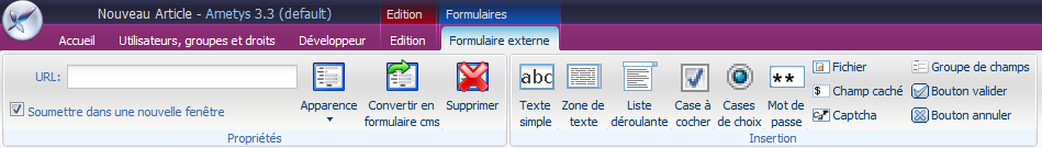
Gérer un formulaire externe:
De même que pour le formulaire CMS, vous pouvez choisir l'apparence du formulaire externe.
URL : adresse vers laquelle les données seront envoyées.
Soumettre dans une nouvelle fenêtre : cocher cette case si vous souhaitez ouvrir une nouvelle fenêtre après la validation du formulaire par l'internaute.
Convertir en formulaire CMS : Tous les champs seront conservés
Cycle de vie
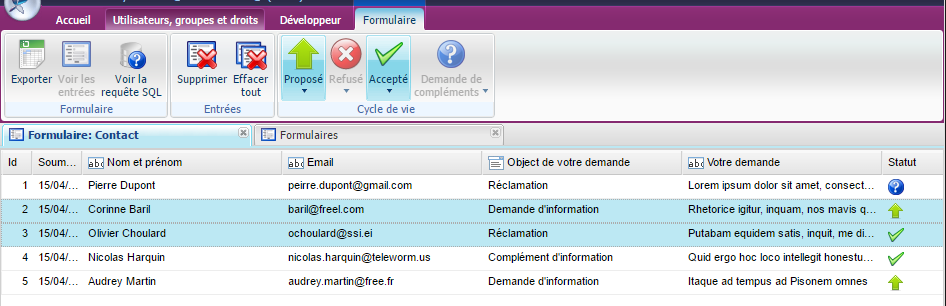
Pour chacun de vos formulaires CMS, vous pouvez choisir un cycle de vie (workflow) qui sera applicable sur les entrées du formulaires (autrement dit les réponses soumises par les visiteurs)
La liste des cycles de vie dépend de votre application. Les cycles de vie sont définis par l'intégration : Plugin Formulaires - Manuel d'intégration v1.9.0
Si au cours de la vie d'un formulaire, vous modifiez son cycle de vie, le statut (état du workflow) de l'ensemble des entrées sera ré-initialisé.
Vous pourrez par la suite faire évoluer l'état de workflow des entrées via l'outil "Entrées du formulaire"
Champs des formulaires
Ceci est la liste des types de champs que vous pouvez insérer dans un formulaire; leurs propriétés sont décrites ci-dessous.
| Champ | Rendu en édition | Informations complémentaires |
Texte simple |
| |
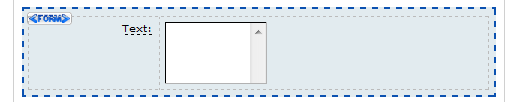
Zone de texte |
| |
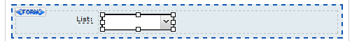
Liste déroulante |
| |
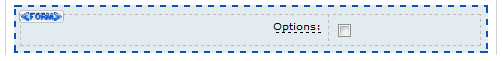
Case à cocher |
| |
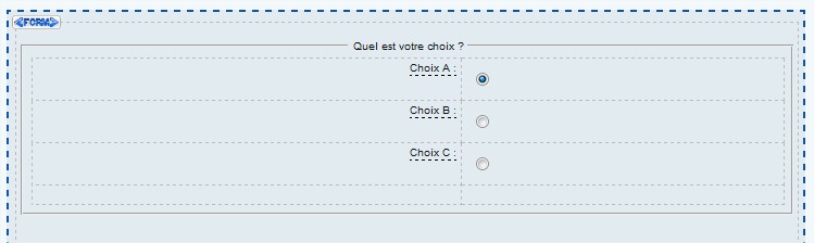
Cases de choix |
| Pour créer un ensemble de cases de choix :
|
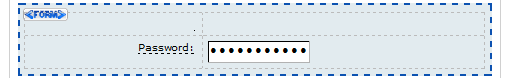
Mot de passe |
| Attention, le mot de passe qui sera spécifié par les utilisateurs sera stocké en clair et visible à l'aide d'un simple export. |
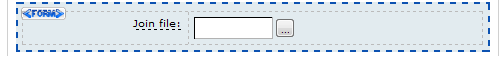
Fichier |
| |
Champ caché |
| Un champ caché est un champ non visible par l'utilisateur. Il sert à stocker des informations qui seront utilisées dans le post-traitement ou tout simplement stockées pour un usage futur. La valeur de ce champ est statique. Par exemple, un script de formulaire externe peut avoir besoin d'une référence pour être capable de savoir où les données du formulaires ont été saisie. Dans notre cas, le champ caché pourrait se nommer fromApplication et avoir comme valeur Ametys. |
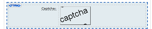
Captcha |
| |
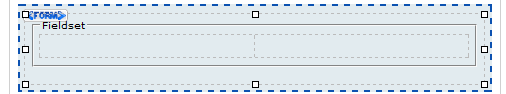
Groupe de champs |
| |
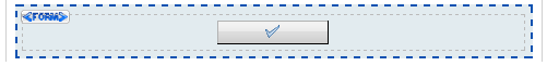
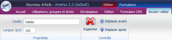
Bouton valider |
| |
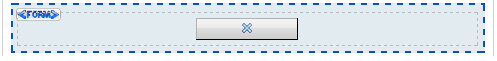
Bouton annuler |
| Ce bouton sert à réinitialiser le formulaire. |


Le rendu des champs en mode édition est à titre indicatif.
L'onglet contextuel propre à chaque champ propose plusieurs zones de paramétrage :
- La zone "propriétés" sert à renseigner les paramètres généraux.
- La zone "règles" sert à définir certains aspects du comportement du champ (contraintes principalement).
- La zone "contrôle" sert à déplacer ou supprimer le champ du formulaire.
Pour que votre site reste accessible, les cases de choix (bouton radio) d'un même groupe doivent être situées à l'intérieur d'un groupe de champs.
Dans le cas d'un formulaire externe, il est important de s'assurer que les identifiants des champs correspondent avec ceux attendus par l'application externe.
Détails des types de champs
Texte simple
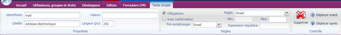
Cocher la case "Obligatoire" pour rendre ce champ obligatoire.
Cocher la case "Avec confirmation" pour ajouter un deuxième texte simple juste en-dessous, de manière à demander à l'internaute de confirmer son entrée. Cette option est surtout utilisée pour confirmer un mot de passe ou une adresse e-mail.
Pré-remplissage: Vous pouvez choisir de pré-remplir automatiquement le champ avec une information de l'utilisateur connecté: Nom, Prénom, Nom complet, Email ou identifiant de connexion.
Attention, le champ sera pré-rempli uniquement si le formulaire est sur une page à accès limité et si un utilisateur est connecté sur le site.
Règle: Vous pouvez choisir une règle prédéfinie en choisissant une entrée dans la liste :
- Entier
- Décimal
- Téléphone
- Date
- Heure
- Date et Heure
- Personnalisé
Puis en renseignant les valeurs min et max au besoin (dépend de la règle choisie).
Si vous choisissez "Personnalisé", vous pouvez spécifier une expression régulière. (Voir le guide dédié de Mozilla pour plus d'informations sur les expressions régulières)
Zone de texte
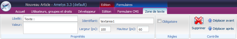
Cocher la case "Obligatoire" pour rendre ce champ obligatoire.
Liste déroulante
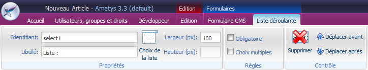
Cocher la case "Obligatoire" pour rendre ce champ obligatoire.
Cocher la case "Choix multiples" pour autoriser la sélection multiple (à l'aide des touches CTRL et MAJ).
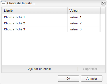
Le bouton "Choix de la liste" permet de peupler la liste des valeurs.
Case à cocher
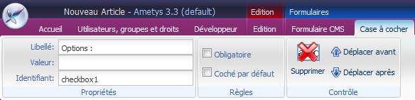
Cocher la case "Obligatoire" pour rendre ce champ obligatoire.
Cocher la case "Coché par défaut" pour que la case apparaisse comme cochée au chargement du formulaire.
Cases de choix
Identique à "case à cocher", sauf pour la propriété "Groupe" qui permet de définir les groupes de cases à cocher. Une seule "case de choix" peut être sélectionnée par groupe.
Mot de passe
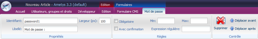
Les caractères sont remplacés par un * à l'écran.
Cocher la case "Obligatoire" pour rendre ce champ obligatoire.
Cocher "Avec confirmation": un deuxième champ mot de passe est ajouté juste en-dessous, de manière à confirmer l'entrée.
De même que pour le champ "Texte simple", vous pouvez spécifier les règles "min", "max" et "expression régulière".
Fichier
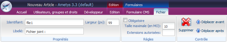
Cocher la case "Obligatoire" pour rendre ce champ obligatoire.
Taille maximale (en MO) : Taille maximale du fichier que le visiteur peut envoyer via le formulaire.
La taille totale du formulaire est limitée par le serveur : par exemple si le serveur limite l'envoie de fichier à 10 MO par formulaire, c'est l'ensemble des fichiers du formulaire qui ne doivent pas dépasser cette valeur.
Champ caché
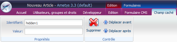
Permet de définir un champ caché (champ de type hidden).
Captcha

Permet d'insérer un Captcha dans le formulaire pour se protéger des robots.
Groupe de champs
Un groupe de champs permet de grouper plusieurs champs ensemble.
Bouton Valider
Bouton annuler

Exemple illustré
Le webmaster ou un contributeur souhaite mettre en place un formulaire dans une page, par exemple un formulaire de contact.
Création et édition de l'article qui contiendra le formulaire.
Nous savons qu'un formulaire est un des éléments pouvant composer un contenu.
Il faut donc tout d'abord créer ou modifier une page puis y ajouter un contenu, voici les étapes à suivre :
- Ouvrir ou créer la page qui contiendra le formulaire
- sélectionner la zone qui contiendra le formulaire
- insérer un article: dans l'onglet Page, cliquer sur Ajouter un contenu et choisir Article
- dans l'onglet Contenu (puisque le nouvel article est automatiquement sélectionné), cliquer sur le bouton Modifier le contenu
Un onglet s'affiche avec l'Article en mode édition. L'onglet Edition est affiché.
Comme dans toute édition de contenu de type Article, le contributeur peut saisir un texte introductif, une image, etc...
Mise en place du formulaire
Une fois en édition sur le contenu, le contributeur peut insérer un formulaire dans n'importe quelle zone riche du contenu. Pour notre article, nous ajouterons le formulaire dans le champ Texte Riche intitulé Contenu.
- Positionner le curseur à l'endroit où positionner le formulaire
- dans l'onglet Edition, cliquer sur la flèche à droite de Formulaire

- cliquer sur Formulaire CMS
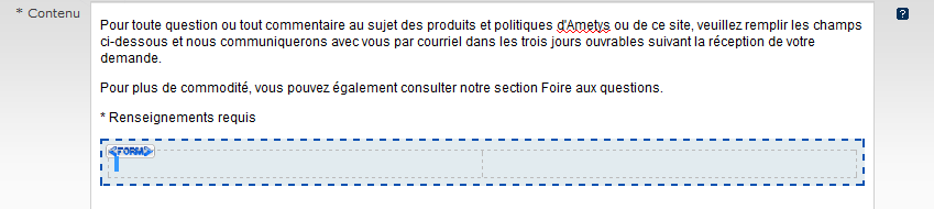
- une nouvelle zone vient s'ajouter dans le contenu, cette zone représente les limites du formulaire
- un nouvel onglet Formulaire CMS est ouvert:
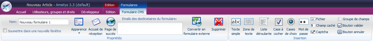
- ce ruban permet de définir les paramètres du formulaire et de construire le formulaire.
Voici un exemple de formulaire de contact en mode édition:
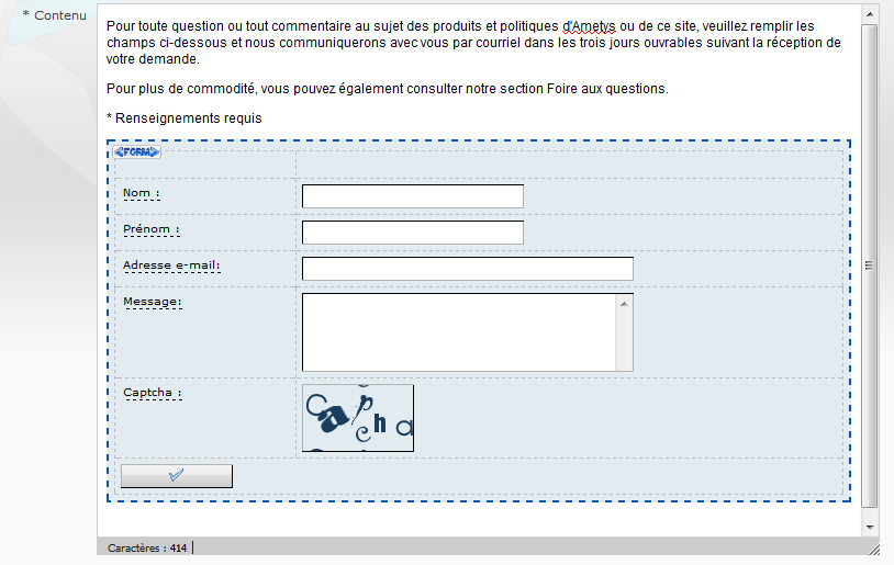
Voici le rendu dans le CMS.

 Retour en haut