Cette page ne doit être appliquée que si le script de migration assistée vous demande de passer la migration manuelle skin.20250926.INTRANET.MainIllustrationResponsive
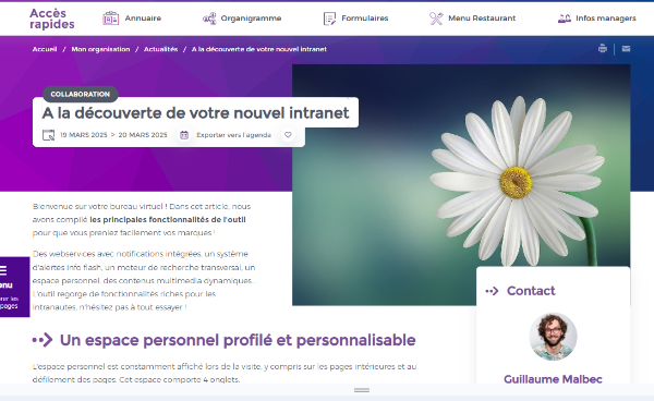
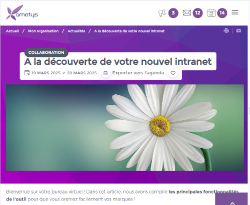
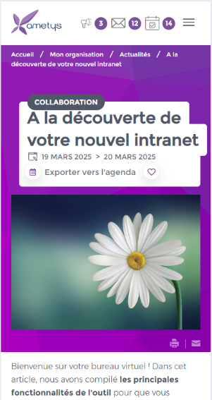
L'affichage de l'illustration principale en page intérieure souffrait de quelques défauts en mode responsive qui ont été corrigés.
Notamment le ratio de l'image était trop variable, il y a maintenant que 2 ratios selon la résolution:
- pour une résolution < 540px et >1150px, l'image est affiché au format 7:5
- pour une résolution comprise 540px et 1150px, l'image est affichée au format 11:4
|
Desktop >1150px |
Tablette > 540px et < 1150px |
Mobile < 540px |
|---|---|---|
|
|
|
|
Par ailleurs, pour une meilleurs résolution de l'image, la balise <picture> est utilisée, et pour faciliter les surcharges la définition de cet élément est isolé dans un template XSL "main-content-img-image"
<xsl:template name="main-content-img-image">
        <xsl:param name="imgType"/>
        <xsl:param name="imgUri"/>
        <xsl:param name="altText"/>

        <picture>
            <source srcset="{resolver:resolveCroppedImage($imgType, $imgUri, 350, 490)}" media="(max-width: 540px)" /><!-- ratio 7:5-->
            <source srcset="{resolver:resolveCroppedImage($imgType, $imgUri, 400, 1100)}" media="(max-width: 1150px)" /><!-- ratio 11:4 -->
            <img src="{resolver:resolveCroppedImage($imgType, $imgUri, 500, 700)}" alt="{$altText}"/><!-- ratio 7:5-->
        </picture>
</xsl:template>Si vous avez surchargé le template "main-content-img" vous ne profitez pas de ces améliorations. Il est conseillé dans votre surcharge de faire appel au template "main-content-img-image" à la place de <img src="{resolver:resolveCroppedImage($imgType, $imgUri, 500, 700)}" alt="{$altText}"/>
<xsl:call-template name="main-content-img-image">
<xsl:with-param name="imgType" select="$imgType"/>
<xsl:with-param name="imgUri" select="$imgUri"/>
<xsl:with-param name="altText" select="$altText"/>
</xsl:call-template>
De plus, si votre image n'a pas les mêmes dimensions que la version noyau (500/700), il est déconseillé de surcharger les dimensions de l'image en CSS (mauvaise pratique pour que l'image garde tjs le même ratio). Laissez height: auto et surcharger le template "main-content-img" pour y mettre vos propre dimensions/ratios.
 Retour en haut